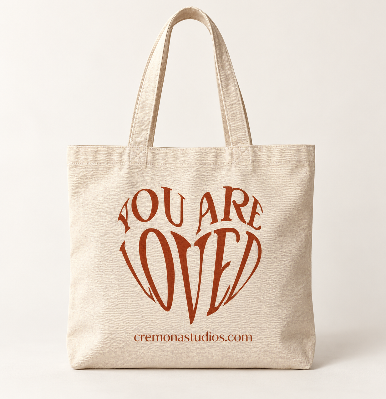
Cremona Studios
Brand Identity & Packaging
Dressing the rhythm within.
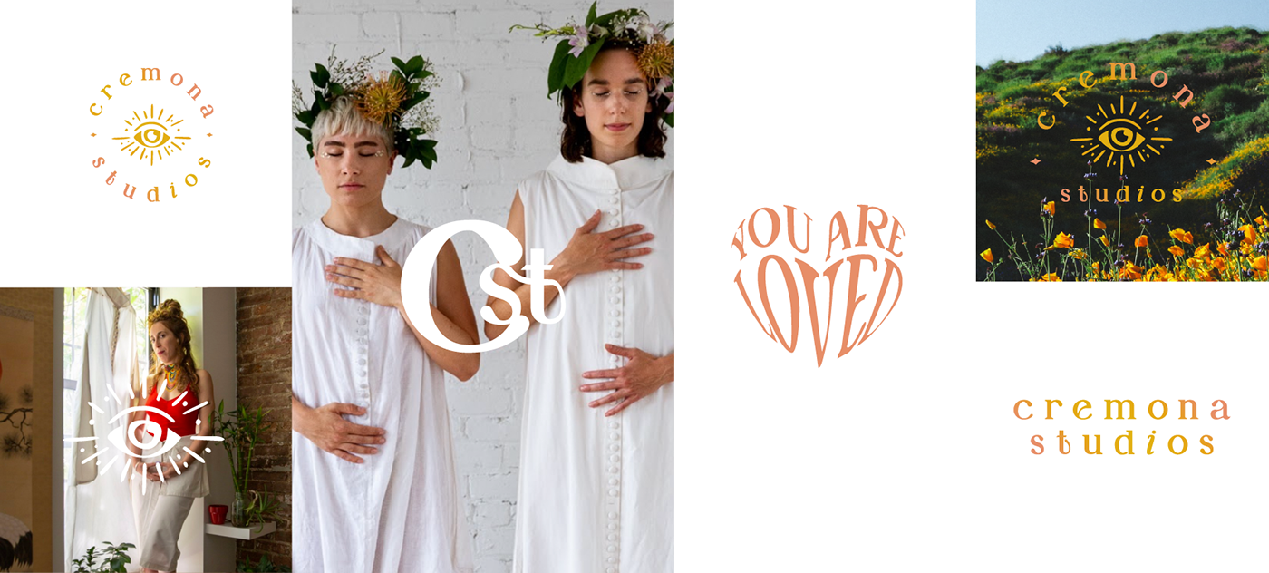
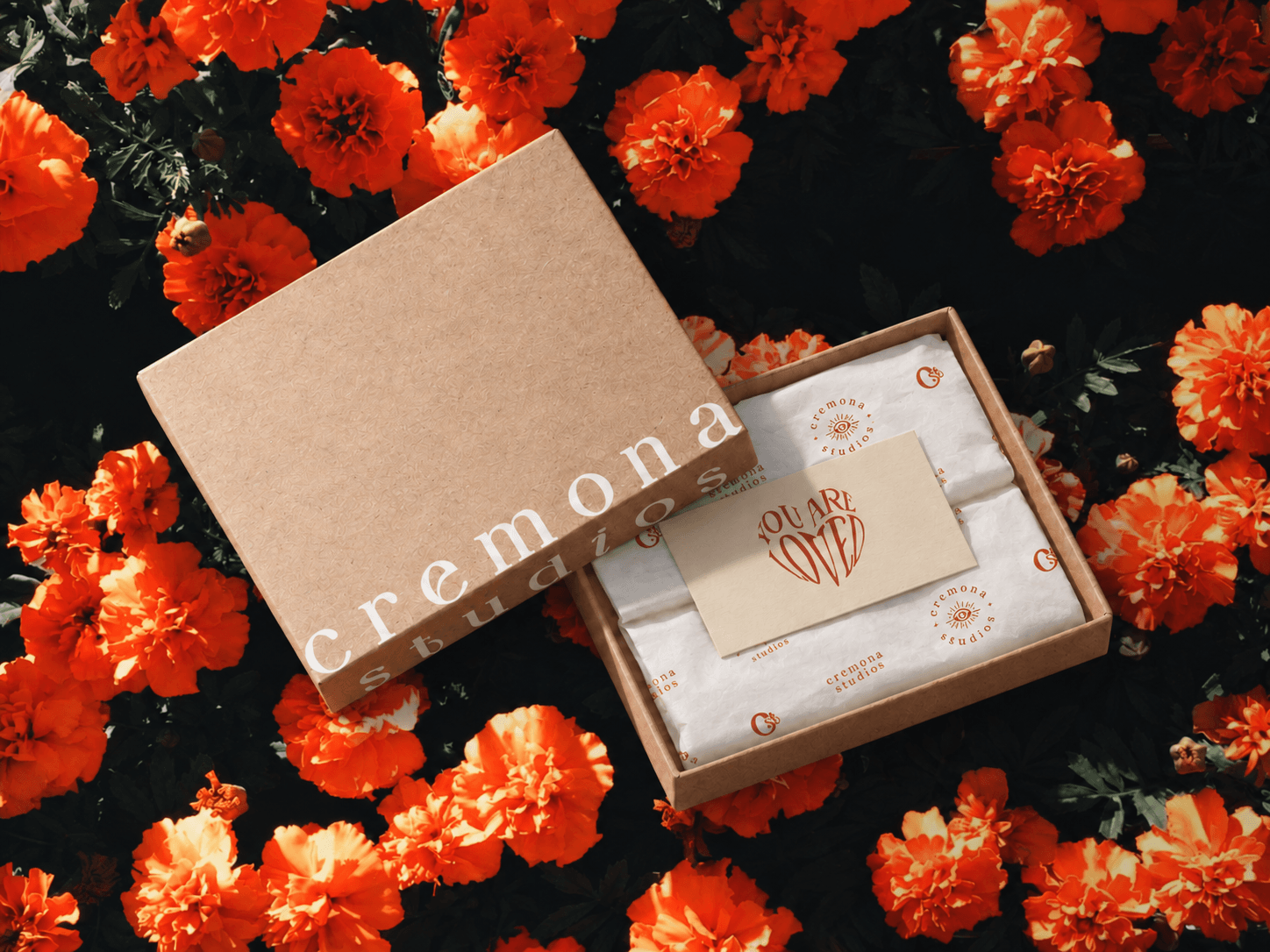
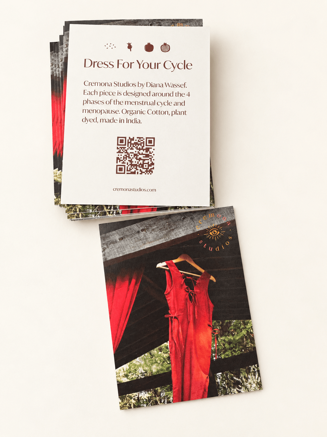
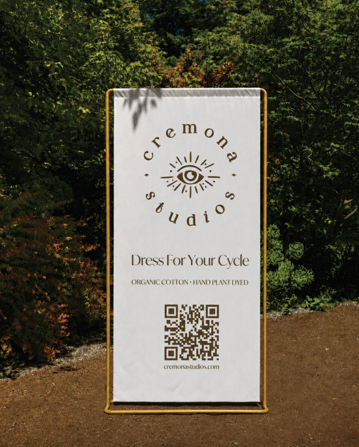
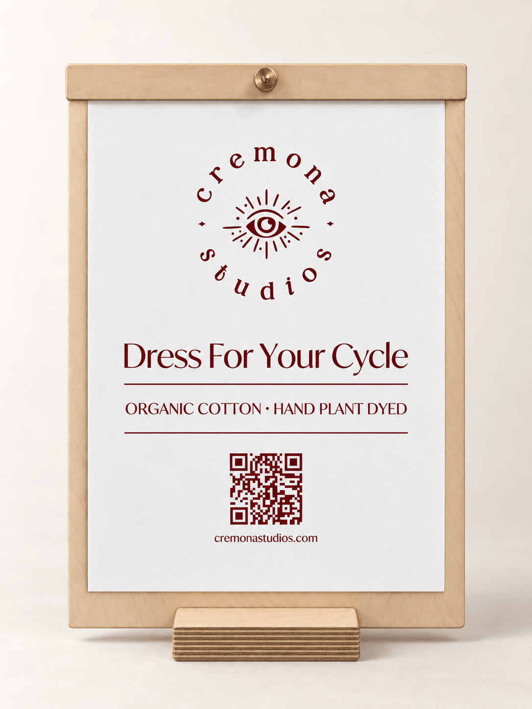
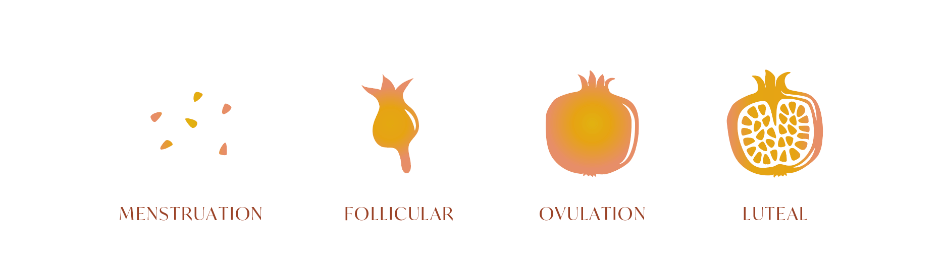
Cremona Studios is a sustainable fashion brand created around the four phases of the menstrual cycle, using clothing as a way to reconnect women with their bodies, nature and cyclical living. The identity needed to express that philosophy without feeling clinical or overly literal. I created a warm, instinctive visual world built around an eye symbol, expressive typography, organic forms and an earthy palette of sunlit yellows, oranges and soft natural tones.
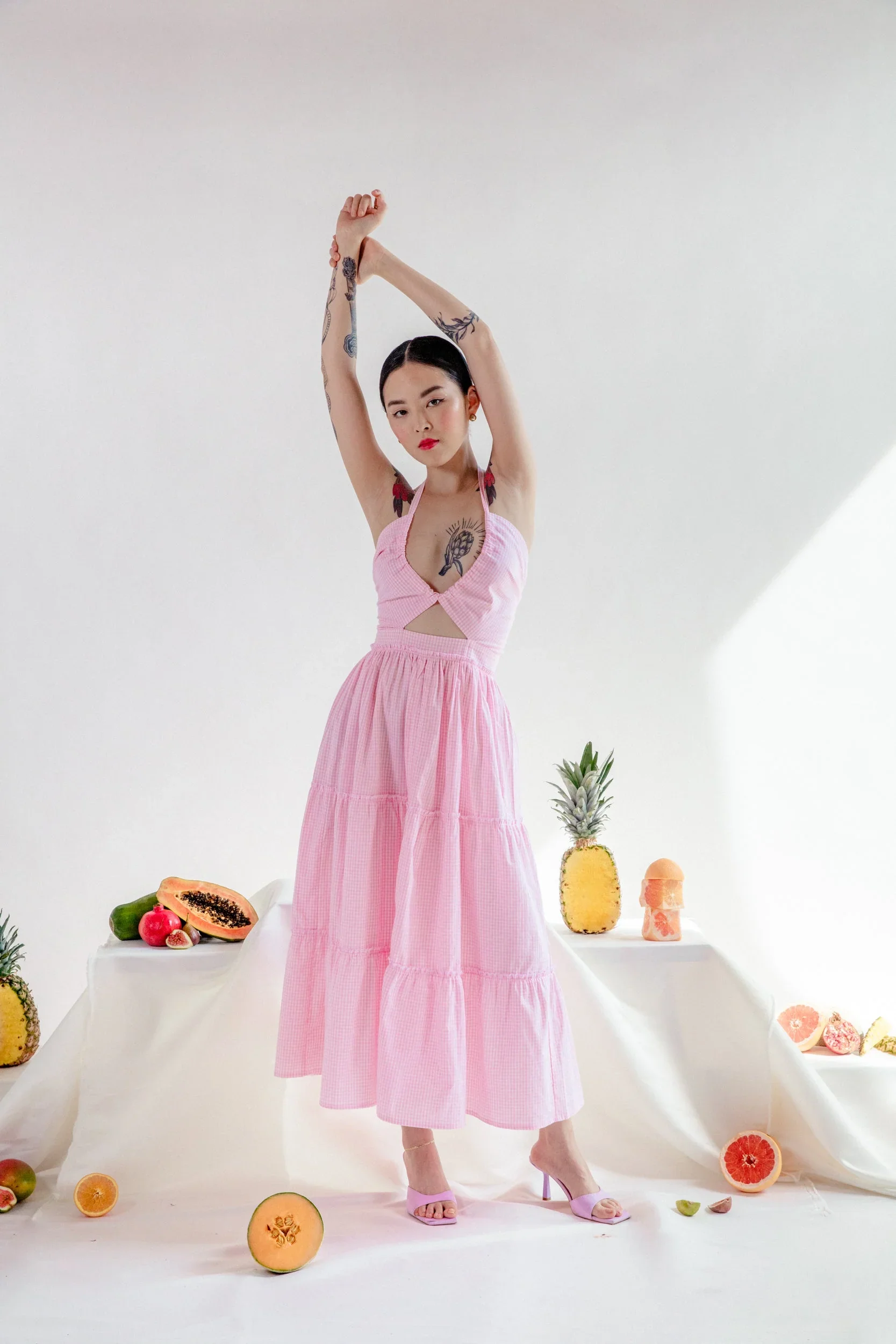
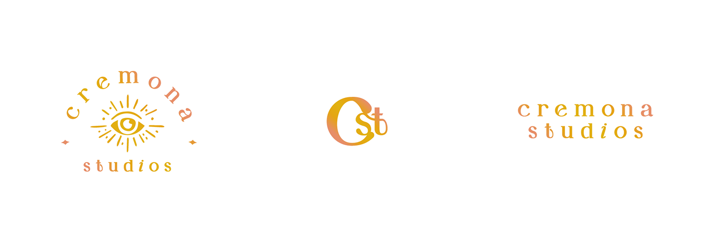



The system balances femininity, spirituality and contemporary fashion, extending from the main identity and monogram to messaging, imagery and brand applications. The result is a distinctive identity that feels conscious, expressive and deeply connected to Cremona’s belief in dressing with intention.